Discovery & Overview
Prepared for marketingmappedout.com by Creative Clout. The thinking behind a video that earns understanding in seconds.
Who we're talking to
The owner this is built for, and what the first few seconds need to do.
The owner is the marketing department. They've already paid for a logo, built a site, and started posting, and none of it quite connects. The marketing budget is small, so anything new has to make sense to them quickly.
A course, a coach, a template bundle. Each one handed back another to-do list, so they arrive assuming this is the same thing. The opening works best if it shows the difference early, since the video may be the only thing doing that before someone decides.
This audience gets marketed at constantly. Calm and specific tends to land better than loud and vague.
One asset that works whether they run a clinic or a camper-van shop.What your buyers are dealing with
The picture they live with, and where the video can help most.
A logo, a website, an Instagram. Each one exists and none of them point the same direction.
A post here, an email there. It never accumulates into something that runs on its own.
Branding that no longer fits, a site nobody visits. That history is part of why the next spend gets a closer look.
Every course taught a tactic. None of them said which thing comes first, so the work never compounds.
They're running the business. Anything that takes more than a couple of hours a week tends to get abandoned.
The sequence. It's a word your site keeps coming back to, and it reframes everything a viewer has already tried. Not more marketing, just the right order. That lands in a few seconds, and it isn't something anyone else in this space is saying.
The rest become supporting beats, or the basis for a second asset later.What they walk away understanding
The viewer's takeaways and how the messaging is digested, in order of priority.
The single idea. It respects everything they've already spent money on rather than telling them they did it wrong.
If they remember nothing else, they remember this.Your line from our call. It says what the product is in one sentence, without needing the viewer to know anything first. Not a course, a coach, an agency, or a consultant.
What it is, before what it does.Clarity to Branding to Website to Email, through to Maintain. This is also the beat that demos the platform, since watching a scattered pile come together is something a course can't really show.
It shows this is a system, not another course.This is the hardest part to convey in text, so it's worth a real moment on screen rather than a claim, since most products now say they have AI. Paired with the Drive handoff, it covers both of the doubts people tend to arrive with.
You make the calls. It makes them make sense.Course completion rates are famously low, so these numbers do real work. Seven cohorts and thirty-plus industries behind them.
The proof beat that answers the course question directly.Right now that's the waitlist. At MVP it may be a purchase. We'd build the ending as its own module so the ask can change without touching the rest of the video.
Why this does the work
You mentioned that investing in ads depends on what you get back. So this is less a video that supports a campaign and more the thing that lets one start, plus a baseline to measure later versions against.
Courses and coaches have trained this buyer to expect a task list, so watching the sequence come together does more than a sentence claiming otherwise. The more of the buying that happens without a conversation, the more of that the video is carrying on its own.
Demoing the platform, your site, social, and the associations and networking groups you're already working through. Someone on your site is further along than someone scrolling, and the hook variants are what let the opening change to match. Same production underneath.
How we'd approach it
For a cold, category-unaware audience, a first-timer needs orienting before anything else.
Oriented fast, then straight into product visuals and payoffs, so watch retention holds.
Enterprise sophistication that belongs in front of a serious operator, but never a boring watch. Modern, on-brand visuals with direct, punchy verbiage.
Words, pacing, and on-screen messaging get locked in Step 1: Scripting. This document is the direction and high-level thinking.
Your real product, brought to life
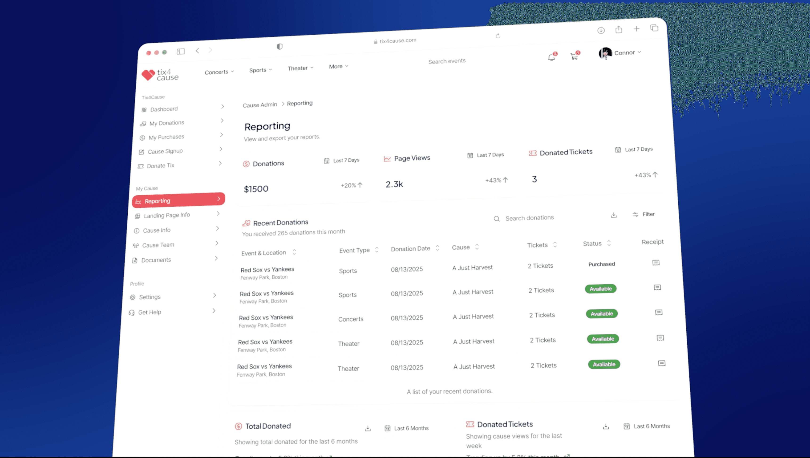
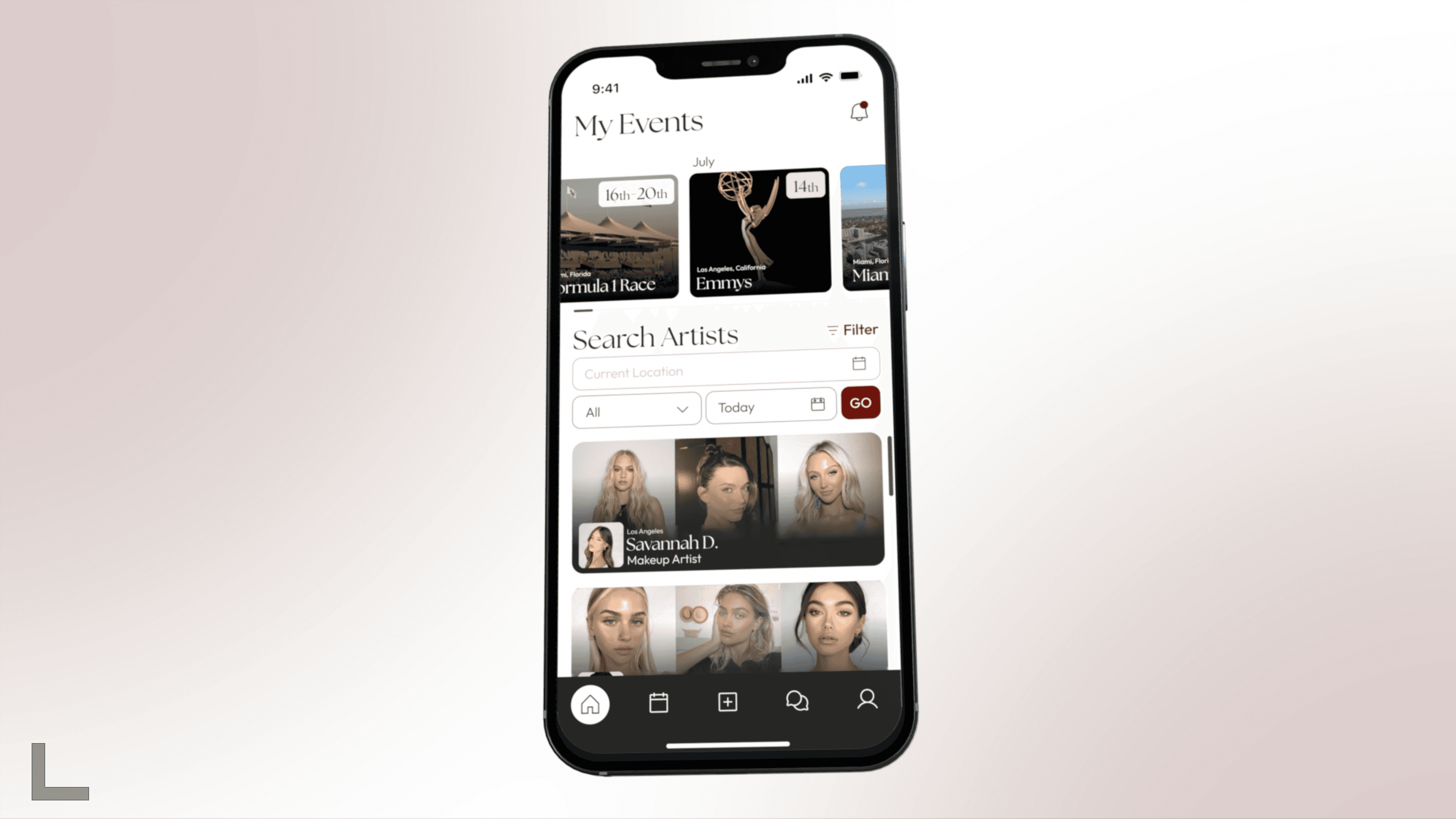
Our designers recreate the interface during storyboarding, then it's animated element by element in After Effects rather than screen-recorded.
Likely a Build in progress, a Compass debrief, and the Living Snapshot filling in over a week. We'd want a walkthrough of the beta before settling that list.
So launch assets and anything after don't start from scratch. It also means that if the UI shifts between beta and MVP, updating a screen is a swap rather than a rebuild.
Pricing & what you get
We'd recommend the set. It's the 60-second master plus every cut that comes out of it, for $1,000 more than the master on its own. Everything included is listed underneath.
One idea, quickly. Works when people already know you.
The master on its own. Room to set up the problem, show the Builds come together, and land the ask.
The 60-second master plus the vertical, the square, and two social hooks. All from one production.
Path forward
About an hour of your time across the whole project. Review the script, review the storyboard, review the final cut. We handle everything in between, roughly four weeks end to end.
This is built from our call and your site, so treat it as a starting point rather than a finished plan. Three things would shape the script most: what Compass actually does on screen, what the ask is at launch, and which of the eight Builds earn screen time. Happy to be told where this is off.








No Risk: We'll refund you if it's not a fit